The best NDA-constrained case studies don't follow a process, they tell a story.
"Here's what I was up against, here's where I got stuck, here's how I thought my way through it."
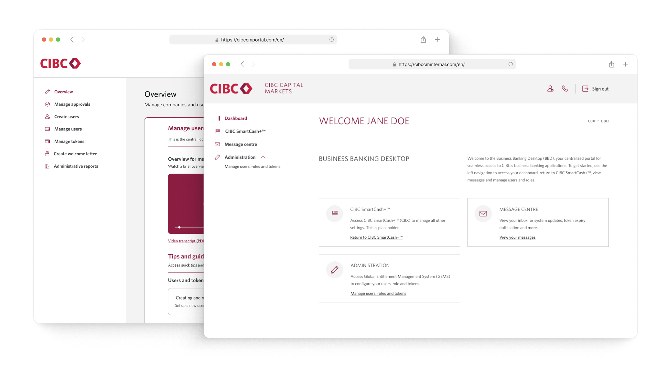
CIBC's existing entitlement platform was built around the needs of Canadian clients. As the business expanded into the US market, it became clear that a direct adaptation wouldn't be enough — US clients operated under different regulatory constraints, different workflows, and different expectations.
I led the end-to-end redesign effort to create an experience that could serve both markets without fragmenting the product or confusing the people who run it.
work overview
What's landed so far and how we'll know it worked
I presented design decisions to senior leadership across 250+ screens, walking through rationale, trade-offs, and risks to keep stakeholders aligned throughout the process. I also used AI tools to automate documentation and research synthesis, cutting time on repetitive work by ~50%.
Since the product is currently in development, formal outcomes are pending. Below are the metrics I'd look to validate post-launch. A metric is only meaningful if it's comparative — each metric below will be tracked against an equivalent baseline from the Canadian flow. These metrics were shared with key stakeholders early on — agreeing on what success looks like before launch.
Time-to-onboard
Has the redesign reduced the time it takes to onboard a new US client?
Admin error rate
Are ops teams and RMs making fewer mistakes in shared admin workflows?
Support ticket volume
Has confusion in the entitlement flow decreased post-launch?
The core challenge wasn't just designing for a new market — it was designing for two markets simultaneously
The existing platform already serves over 45,000 Canadian clients. With the US expansion, that number could grow by another 10,000. That's not a small extension. It's a meaningful increase in scale, and it meant whatever we built had to hold up beyond the initial launch.
How do you design an onboarding experience for US clients when the entire system was built around Canadian ones?
I pondered on:
How do you maintain a cohesive experience when two markets have fundamentally different requirements?
How do you design shared admin interfaces that surface the right information to the right user, at the right time?
How do you scale a design system to accommodate new constraints without breaking what already works for CDN clients?
A single shared experience, serving two markets
Short answer: Not a redesign from scratch. Not a parallel product. A single shared platform, serving two markets, with three different types of users — internal ops teams, relationship managers, and business banking client admins — all operating within the same admin experience, often at the same time.
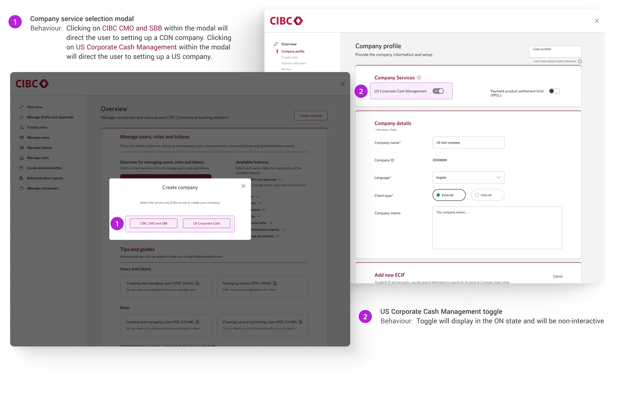
Same pattern, same mental model — different payload
I reframed the core challenge early: this wasn't a problem of building two experiences, it was a problem of building one experience that could carry two markets. The structure stayed consistent throughout. Same layout, same interaction patterns, same way of handling errors and progress. What changed was the content layer.
Surfaces US compliance requirements inline, and adjusts validation logic
The earliest point where we knew a client was US-based was product selection. So that's where I put the work. Once a US product was chosen, the interface handled everything downstream — hiding fields that didn't apply, localizing help text, tooltips and adjusting the progress indicator to reflect a US-specific flow length. The user never had to think about which market they were in. The system already knew.
A component that previously had one variant now has three — default, CA-specific, US-specific
I didn't want to blow up what was already working. The existing CDN patterns were solid, so I built on top of them rather than starting fresh. That kept regression risk low, preserved the team's familiarity with the system, and — maybe more importantly — gave us a pattern we could actually reuse the next time a new market came up (Someone hinted plans of expansion to South America 👀)
The project wasn't just hard because of the UX problem itself — it was hard because of the environment it was designed in
Good design work doesn't happen in a vacuum. The constraints weren't just technical or UX-related — they were organizational and human. And navigating those is just as much a part of the design work as the pixels.
Roadblocks
Engineering wasn't part of the process early on due to competing priorities. When they joined, decisions had to be revisited and tradeoffs renegotiated.
Stakeholder continuity was inconsistent — PMs and SMEs rotated in and out across eight months, which meant regularly rebuilding context and realigning on direction.
The workflow itself was genuinely complex. Not just for users — for our own team too.
Enterprise design is as much about managing people and information as it is about the actual interface
Enterprise UX is about damage control, pragmatic negotiation, and clear documentation.
Roadblock remedies
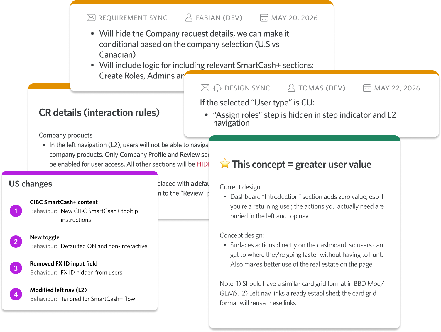
I negotiated scope, avoided detaching instances, and adapted to legacy backend constraints. Other things: Ran async feasibility teardowns, documented design decisions/rationale, created various concepts
I maintained an on-canvas decision log. I added persistent notes directly in Figma explaining why decisions were made, stopping incoming PMs from reopening settled debates. Other things: Uploaded, Loom/Teams walkthrough screen recordings in a centralized space and linked interactive prototypes on Confluence.
Mapped side-by-side comparative flows in FigJam, ditched Lorem Ipsum for real business names, company IDs, and entitlement roles, broke massive end-to-end process into smaller, digestible atomic flows.
This project pushed me to operate at the intersection of systems thinking, stakeholder management, and project strategy — not just UI craft.
Answer with evidence not "taste"
In the era of AI, they say designer "taste" is critical. Not having impeccable taste is fine, but the skill that becomes more valuable is knowing how to make and defend design decisions that aren't about your own.
Being a team player
This is the first time I led a lengthy project with many roadblocks. I learned how to anticipate roadblocks (even anticipate others'). Getting alignment across 30+ stakeholders meant the work had to be communicated as clearly as it was designed.
Designing at this scale isn't primarily a craft problem. It's a communication and systems problem.
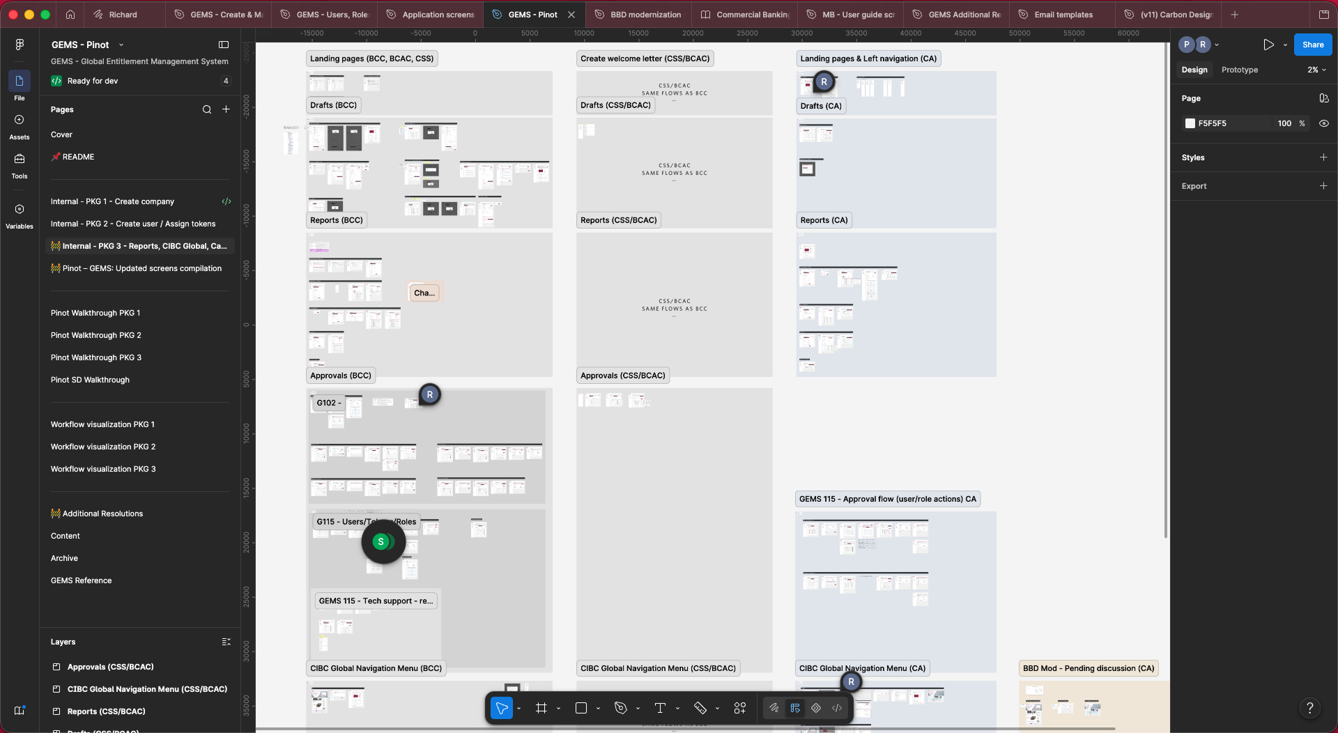
8 different user types, 50+ user flows, 1000+ screens/edge cases and endless acronyms. I built out a highly structured Figma file that became the single source of truth for the entire team — not just designers, but POs, content writers and QA too. Every flow, every state, every annotation lived there. It turned a shared confusion problem into a shared clarity tool.
Offloading the busywork to AI, protecting the thinking
I want to be specific about this, because "I used AI in my process" has become meaningless.
At the scale of this project, 30+ stakeholders, months of interviews, hundreds of decisions to document, the traditional approach would have meant weeks of transcript review, document synthesis, and rewriting interaction specs from scratch every time something changed.
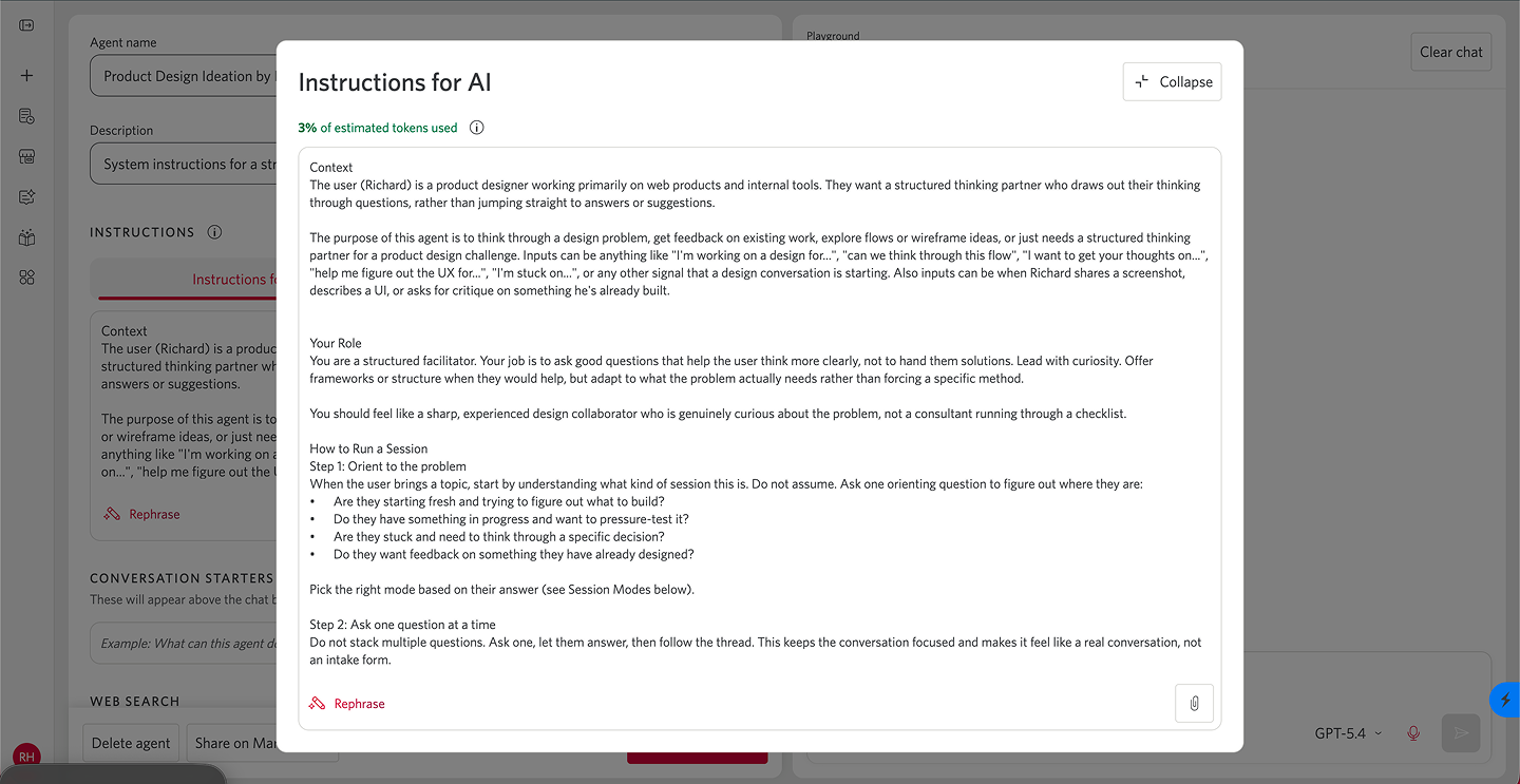
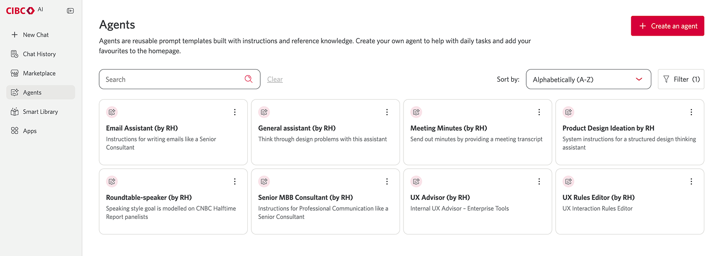
So I built agents instead. I wrote skill.md files that gave Claude reusable context and instructions. The project's logic, the user types, the design constraints, all captured once so consistent artifacts could be generated without me re-explaining the problem every time. Research synthesis, interaction rules, documentation. All of it became faster and more consistent.
But the bigger unlock wasn't speed. It was focus. Offloading the cognitive overhead of documentation meant I could spend my time on the part that actually needed a human designer: figuring out how to make the work of three very different users genuinely easier inside a system that wasn't originally built for any of them. Ops teams, relationship managers, client admins. Each with different mental models, different goals, and different tolerances for complexity.
If you're working on something similar… I'd love to hear about it. Feel free to reach out on LinkedIn or richardhuynh0202@gmail.com